To follow the theme of my post from two days ago,“hey, what are we actually measuring?”, I want to recap a classic public health example in the same vein: heat-related deaths during the June–July 2018 heat wave in Quebec and Ontario.
Per the Toronto Star article:
Sixty-six people died from the heat in Montreal in the first week of July 2018. Eighty-nine across Quebec.
Yet zero in Ottawa. Zero in Ontario.
The Ottawa River, which divides the two provinces, didn’t separate two major weather systems last summer. Heat and humidity ignore political borders.
There are differences between Quebec and Ontario, such as the greater prevalence of air conditioning in Ontario. But can these factors really be responsible for such a stark disparity? According to Montreal public health official Dr. David Kaiser, the real story here is measurement, in particular the strictness with which Ontario defines heat deaths compared to Quebec:
This is because people who die during heat waves are not dying from heat stroke, a medical diagnosis that is coded into medical records, Kaiser said. If you only count deaths by heat stroke, you’re missing the vast majority. […] “If the coroner doesn’t have information that he had an elevated body temperature, signs of heat-related illness, heatstroke and shock, they won’t count it as a heat-related death.”
Most people who die as a result of a heat wave do not die directly from heat-related illness, but rather the heat exacerbates underlying conditions into triggering fatal events like heart attacks and strokes. While the people dying are often medically frail, we can attribute a casual role to heat if we believe the event would not have occurred when it did but for the heat wave.
This story is a good illustration of why it’s important to establish what is actually being measured when performing a comparison between two jurisdictions. By working with first responders and emergency departments, the province is able to develop a broader view of who is vulnerable to the effects of heat waves, allowing cities to adjust their extreme heat plans to (hopefully) help mitigate these harms.
…and that’s where this post would have ended, if I didn’t bother to look up death counts for the relevant periods in Ontario and Quebec.
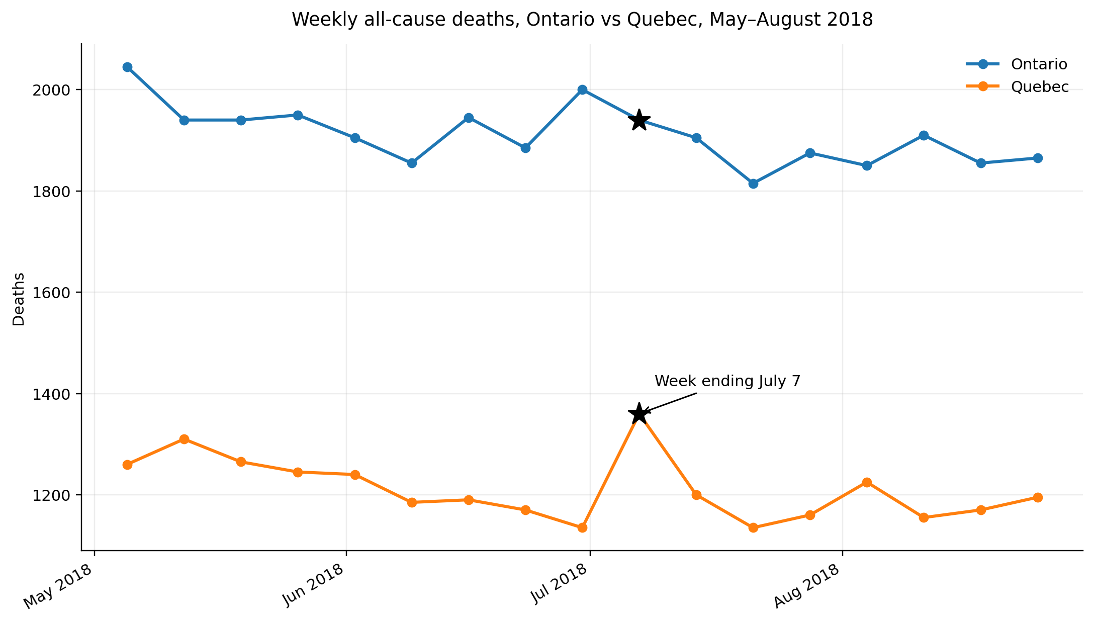 Source: Statistics Canada. Table 13-10-0768-01 Provisional weekly death counts, by age group and sex.
The heat wave took place mostly during the week ending July 7, overlapping a day or two into the weeks before and after. We see Quebec has a clear spike during this week, whereas Ontario…doesn’t. Obviously, there is a lot of variability in death counts from week to week, and this variability can cover up the effects of short-lived exposures on mortality outcomes. But it’s hard to ignore that obvious spike in Quebec!
So maybe this story isn’t the straightforward measurement story I’ve thought it was for years? I don’t know, but I do think Quebec’s approach of defining heat-related deaths broadly is generally the correct one. But maybe there’s something else going on here—thresholds maybe? Small differences in inputs can create big differences in outcomes when you are dealing with a very medically fragile population.
It’s worth looking more into heat-related deaths, I think. After all, climate change will only continue to make extreme heat events more common.