
Which date counts?
Two types of ghost curves
I recently read this post from Paul Goldsmith-Pinkham on why the number of economics preprints submitted to arXiv and similar preprint servers is not exploding quite as dramatically as some charts suggest.
Basically, if you plot papers by the date they were last updated, you create a large upward bias in the most recent months. Old papers revised today are counted alongside papers first submitted today. The chart will therefore show a sudden explosion near the present whenever you produce it.
If you plot the papers by their first submission date instead, and recent growth looks much closer to the historical trend. Goldsmith-Pinkham still found that the number of new papers was growing faster across most of the fields and preprint servers he examined, but the apparent vertical takeoff was partly an artifact of the date variable.
This all reminded me of one of my COVID-19 pandemic hobbyhorses, which annoyed me enough that I wrote a paper about it: which date variable to use when plotting an epidemic curve.
Epidemic curves are commonly plotted by either date of symptom onset or date of public reporting. Symptom onset is closer to the actual infection, and so intuitively seems to offer a more “real-time” view of the epidemic. But recent dates on a symptom onset curve are necessarily incomplete unless 1) every person who eventually becomes a case seeks testing on the first day they experience symptoms, 2) every person who seeks a test receives one the same day, and 3) every test is processed and reported the same day it was taken. None of these assumptions hold in an infectious disease outbreak. Early on in the COVID-19 pandemic, a case reported today may have first developed symptoms days or even weeks ago. New cases are continually added to the older part of the symptom onset curve.
The result of using symptom onset date is a permanent negative bias at the right edge of the graph—or, as I like to call it, a “ghost curve”. Plotted this way, the epidemic always appears to be collapsing, even when it is exploding. This misinterpretation was common on social media and even among some public officials. While symptom onset epidemic curves are useful for telling the story of an outbreak retrospectively, after data have been collected and finalized, presenting them in real time without correcting for reporting delays invites entirely preventing misunderstanding.
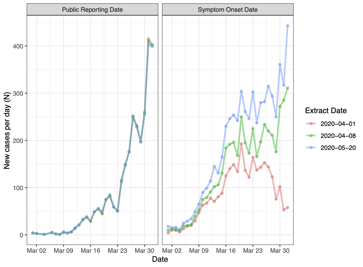
Different views of epidemic data for COVID-19 in Ontario, Canada for March 1, 2020 to April 1, 2020 plotted by episode date (left) and public reporting date (right) using three datasets extracted between April 1 and May 20. Source: Soucy, Buchan & Brown (2022) (CC BY-NC-SA 4.0).
The two errors discussed in this post are conceptually similar though pull in opposite directions. Plotting preprints by their last update pulls old papers forward on the curve and creates a phantom boom. Plotting cases by symptom onset pushes newly reported cases backward on the curve and creates a phantom decline.
Sometimes the most dramatic part of a trend is just an artifact of how you measure it.