
Everyone must have noticed the torrent of restaurants featuring pictures of weird, gross-looking AI-generated food that in no way resembles what you are served (usually for the better).
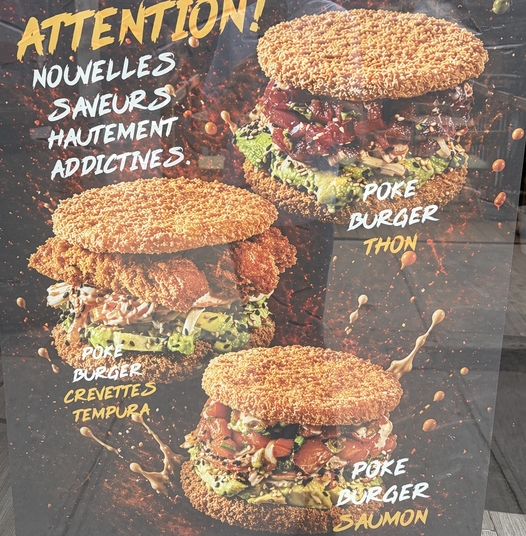
Here are some examples from my city this summer.
The slop burger:
And the slop biryani, which is more perplexing than gross:
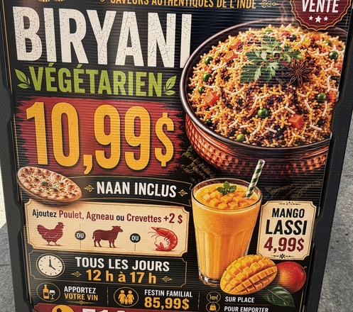
Of course, we’ve all seen way worse examples. Those are just the ones I happened to have on my camera roll. Even the “good” examples of AI food images tend to have an uncanny, slightly unsettling quality. Certainly no restaurant should be completely fabricating what its food looks like, but it has unfortunately become normal to shamelessly lie about the nature of your core product. What surprises me is that the bar for what restaurants will use to advertise their business is so low.
I am sure someone will come along to tell me that the newest models have fixed this, but I bet we will continue to see these repellent AI ads from clueless restaurant owners for some time to come.
Anyway, this post isn’t actually about AI slop food pictures; I just wanted an excuse to dump those screenshots in the preamble.
What I really want to share was this interesting post from John Hartnup about designing better AI posters. He opens with examples of the ubiquitous AI event poster: cramped, busy, garish, exhausting, trying to do entirely too much. Then he shows that, with a little more direction and experimentation, it is possible to generate posters in a variety of styles that are marked improvements on the default.
A lot of the posters in the catalogue he produced still immediately jump out with the generic AI slop style. But here are some of the styles where all four provided examples don’t immediately provoke this recognition:
- Monochrome + Single Accent
- Cut Paper / Matisse
- Cuban OSPAAAL Revolutionary
- Atelier Populaire / Paris May 1968
- New Wave Typography
- Contemporary Flat Illustration
- Low Poly
I’m sure some people will have different reactions from me to each style. The point is that businesses using these AI generation tools don’t automatically have to produce something repulsive.
I still have mixed feelings about these advances. On the one hand, I am happy that it is easier than ever to create posters to attract people to community events. On the other hand, we have seen from the restaurant examples that even commercial enterprises are willing to completely forgo quality in marketing their core products as long as the process is basically free. And the bar must be lower still for non-profit and community events.
One might have expected cheap image generation to raise the quality floor for images. Instead, it may have lowered the amount of care people are willing to put into art. A restaurant used to have to at least set up a camera and maybe some lighting to get a picture of its food. Now it can generate something almost instantly, and many restaurateurs have apparently decided that is good enough. Hartnup’s examples make this all a little more mystifying, because the cost of producing noticeably better art is also very low.
As I wrote before about ubiquitous image generation, what happens to the art world when all of the individually harmless uses of AI art add up to a new and ruinous expectation: bespoke images everywhere, instantly, for free? The question stops being “do we need an image?” and becomes “why isn’t there an image?” Quality is another question, one seldom asked.
See also the discussion of this post on Hacker News.